Making a technical product available to non-technical users.
The data science team at Lytics had developed technology that let marketers target customers who are likely to buy something with advertisements, but it existed mostly as a set of API endpoints. For this product to succesfully go-to-market, it would need a UI that marketers could easily understand.
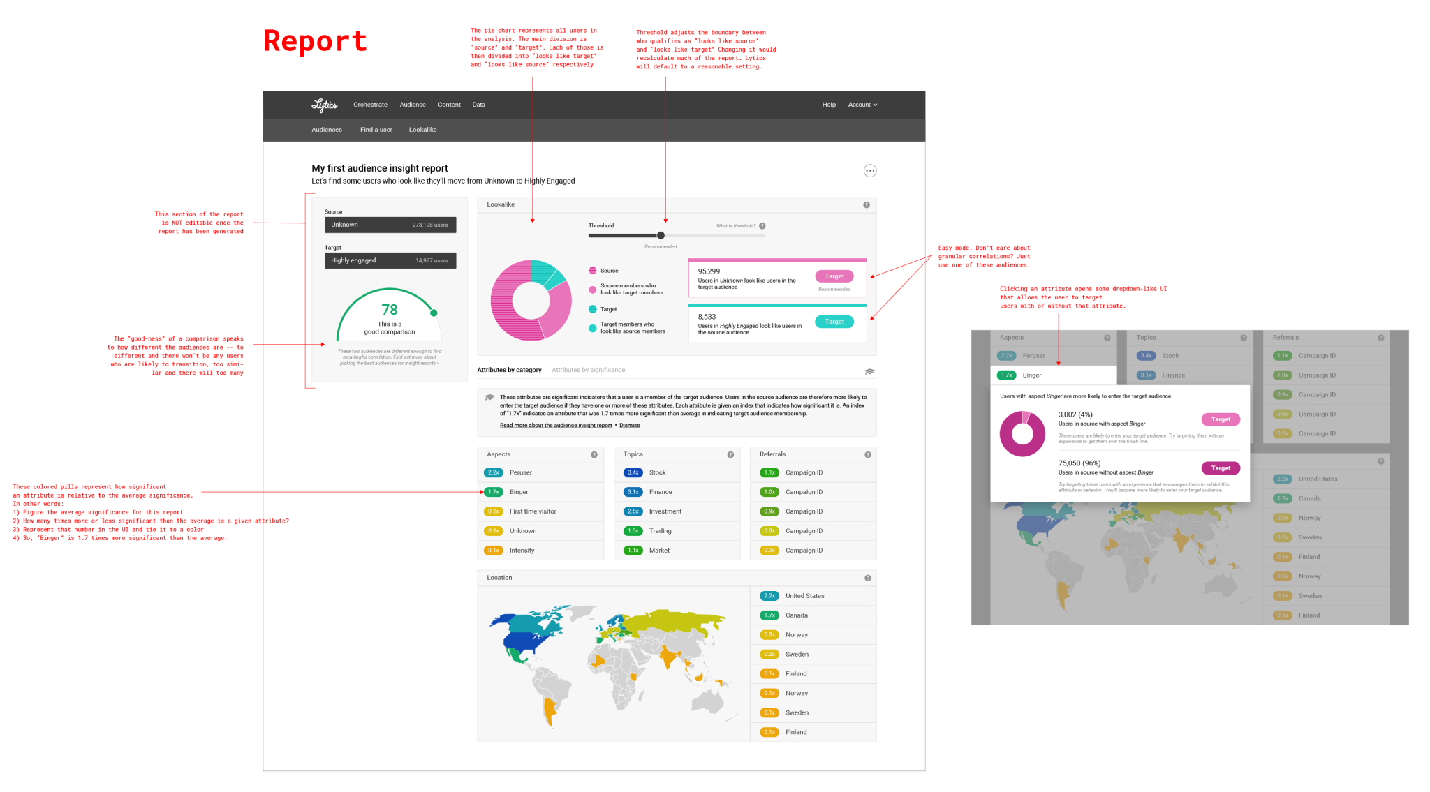
I began this project by interviewing our lead data scientist to learn about the available data. I produced the wireframe below from out conversation.
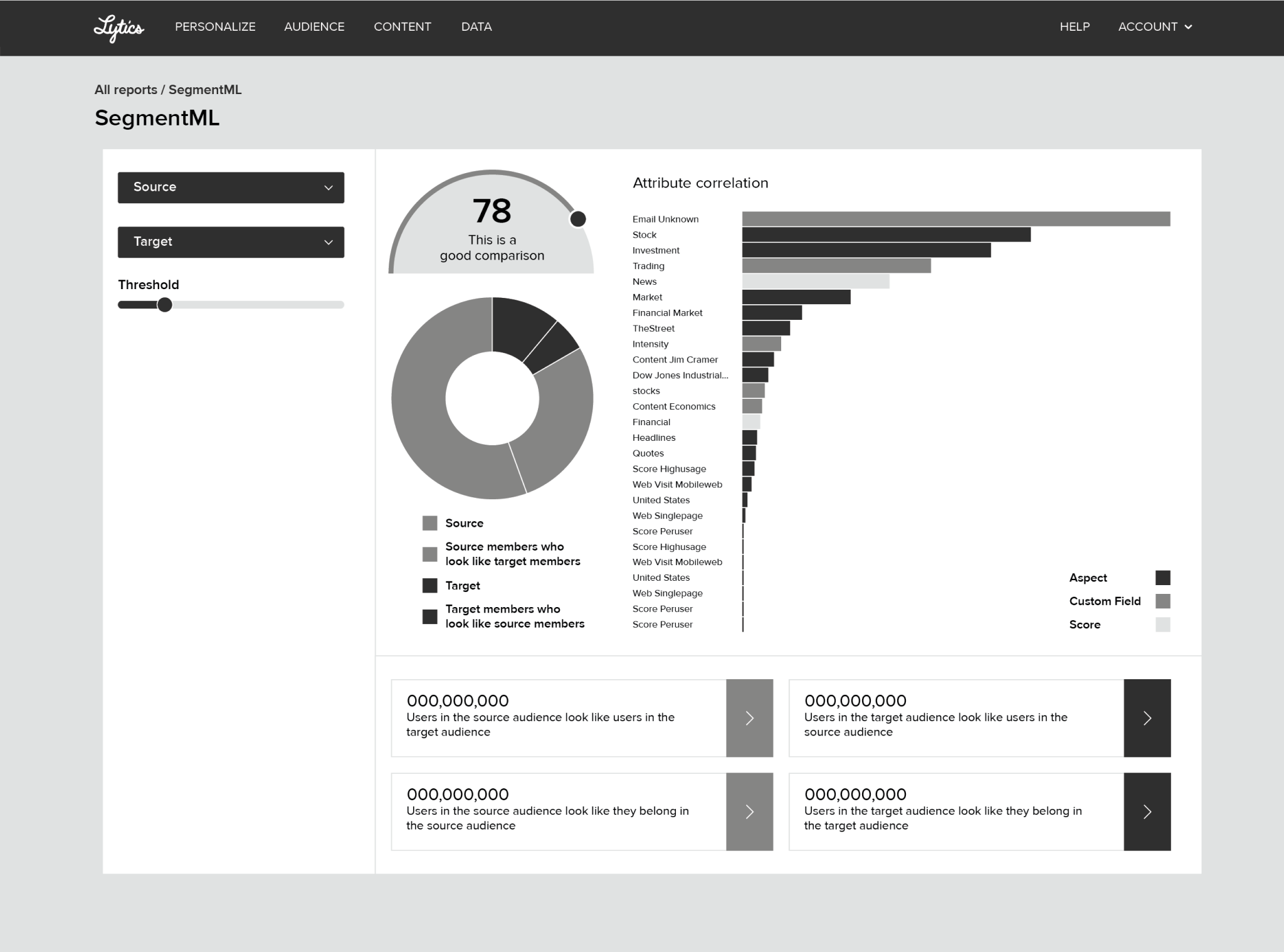
This wireframe served as a conversation starter for gathering more feedback. What I heard was that many parts of the intial wireframe were still too technical. A histogram that showed the “significance” of user attributes didn’t really mean anything to a marketer. So I abstracted the report a bit futher. “Significance” became an index, so marketers could better see the relative importance of an attribute in a model. I also considered introducing data visualizations that would be immediately faimilar, like a map.
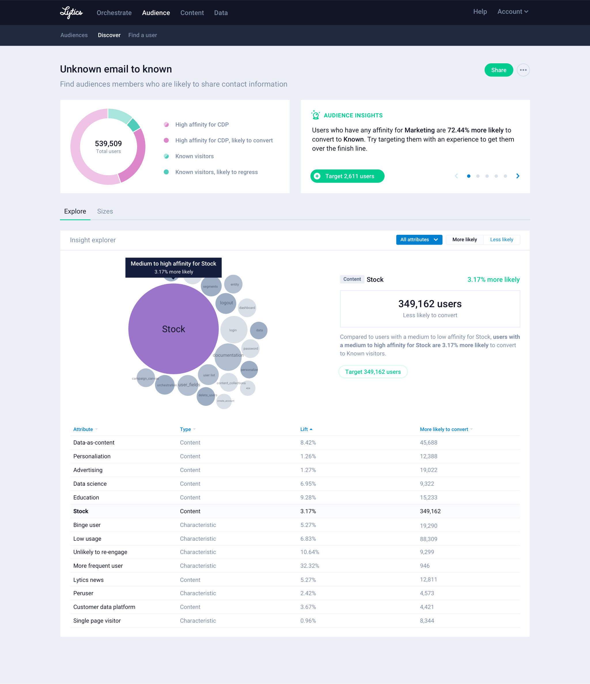
The final design takes a couple cues from existing Lytics reporting (like the bubble chart). But more importantly it surfaces actionable, human readable suggestions. These suggestions are generated from the like of “significant” attributes, and they let marketers get value out of this report extremely fast.
Generating a single report is fairly resource intensive so we left that out of the product and leaned heavily on our professional services team for that. Future releases will need to provide a workflow that lets users create and manage their own Insight Reports.
This product successfully went to market, with some customers ordering 50+ reports. In retrospect, I think the intial release could have been quite a bit smaller, with more emphasis on the actionable parts of the report, and less emphasis on the data visualization.