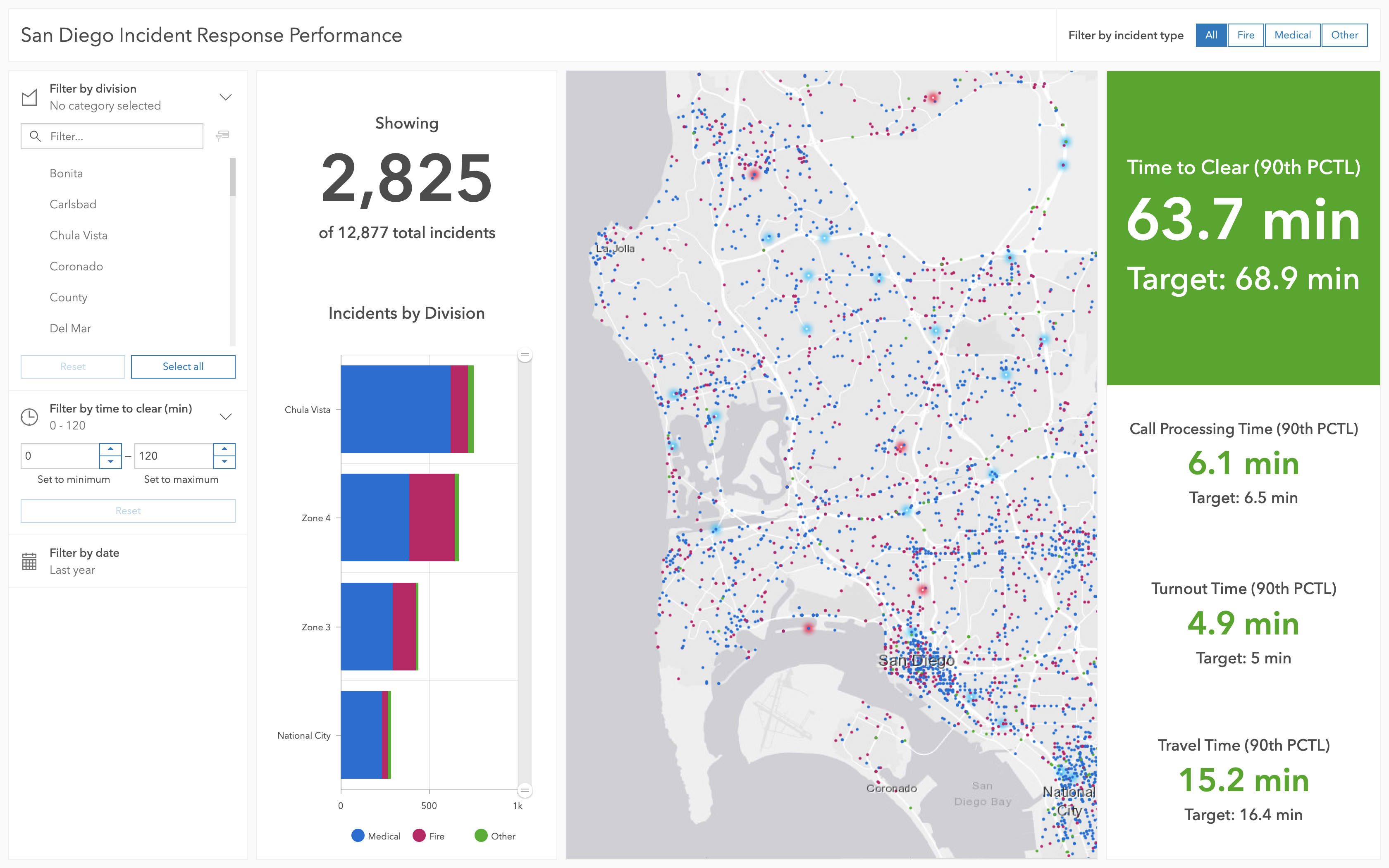
ArcGIS Dashboards is a visualization tool for GIS (geographic information systems) data.
The ArcGIS Dashboards UI had been built using a now outdated version of Esri's design system, Calcite, and needed to be brought up to the latest version. This change would affect nearly the whole authoring UI and afforded the team a chance to rethink known friction points across the app.
I began by auditing the UI in order to map our existing components to Calcite components. In a some places, this turned out to be a one-to-one change.
For areas we know were friction points, I opted for a more thorough redesign.
This was a really large project, so after mapping out how the current component would transition to Calcite components, I worked with developers to come up with a phased implementation plan. Each phase was followed with a round of usability testing.
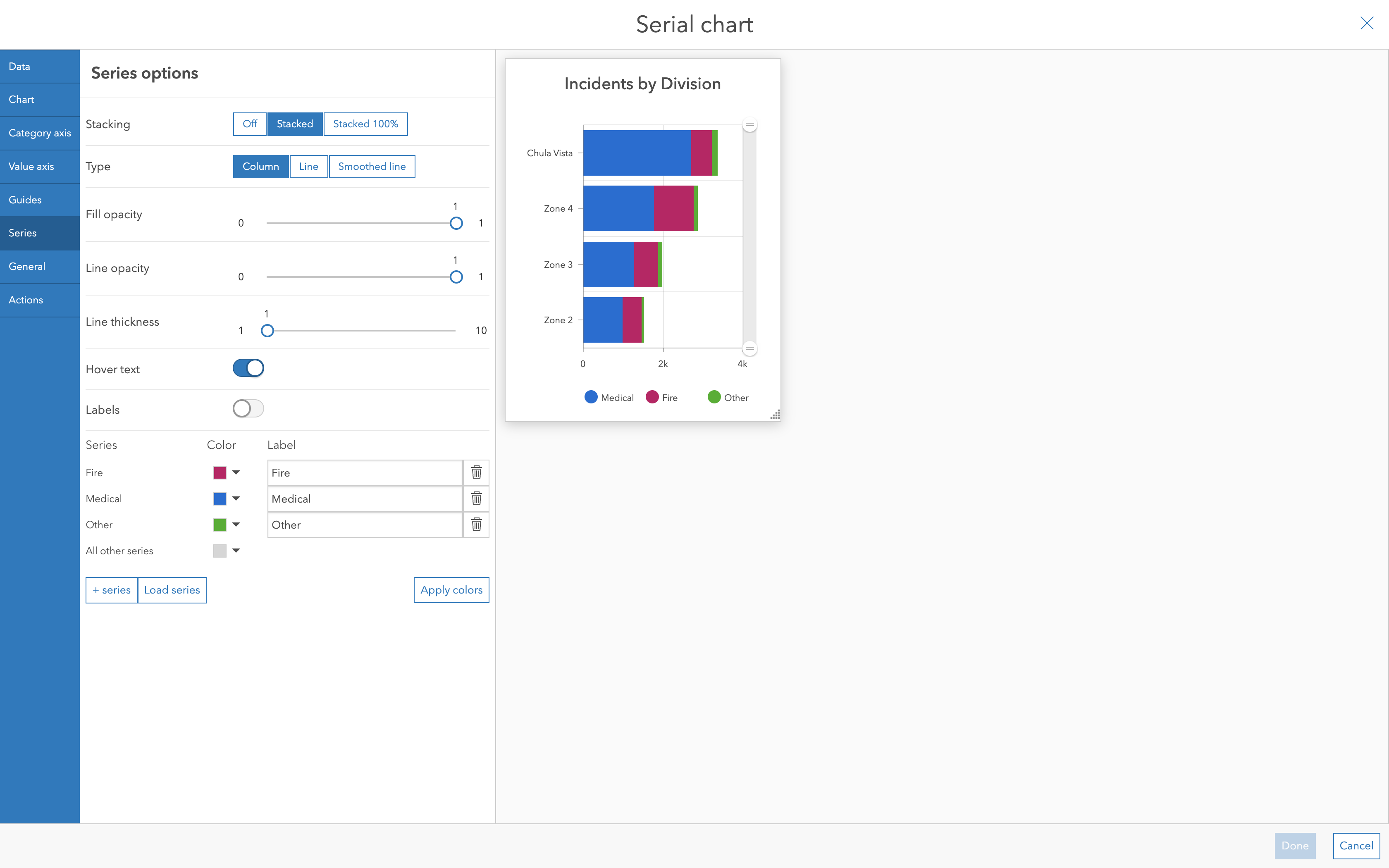
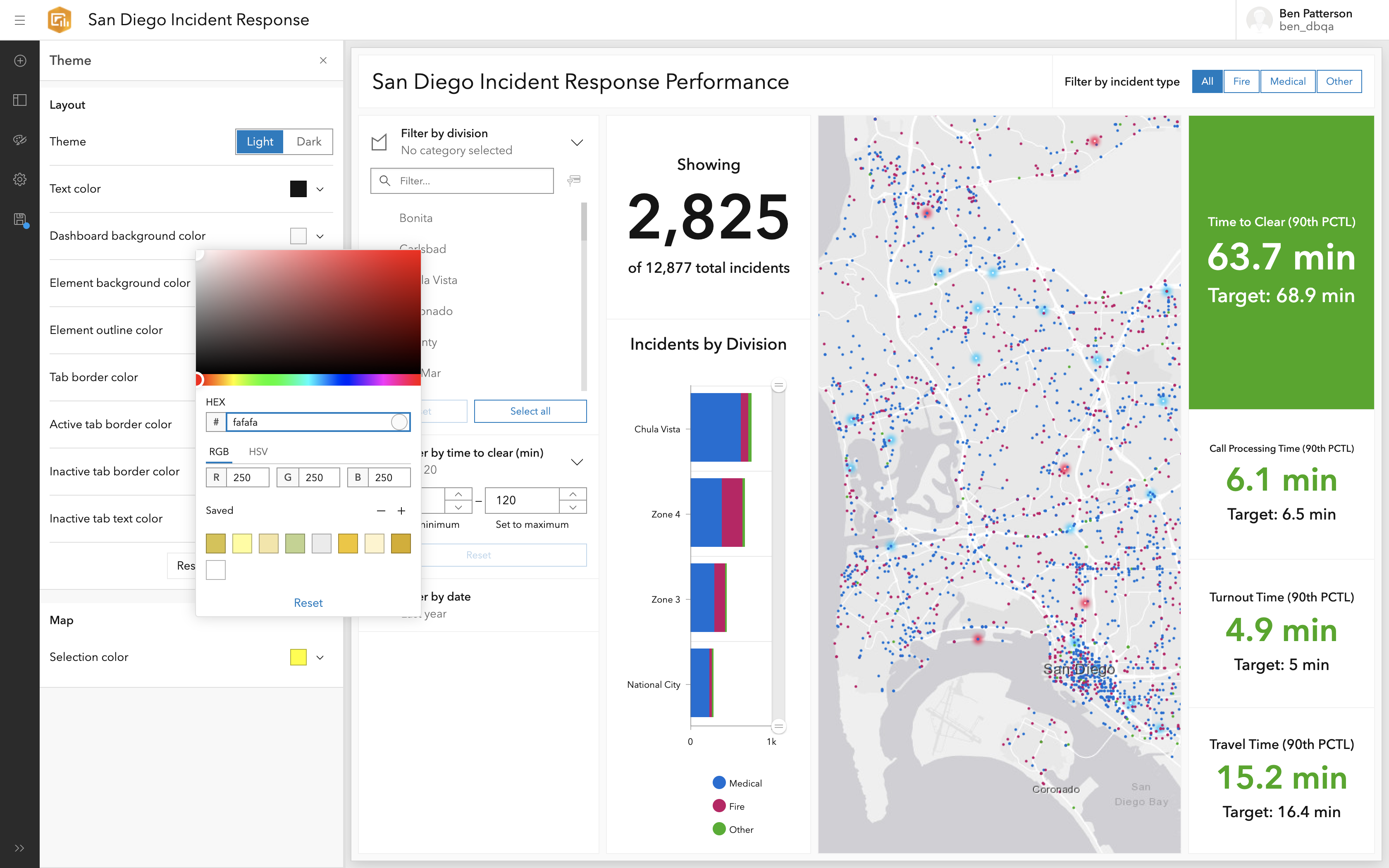
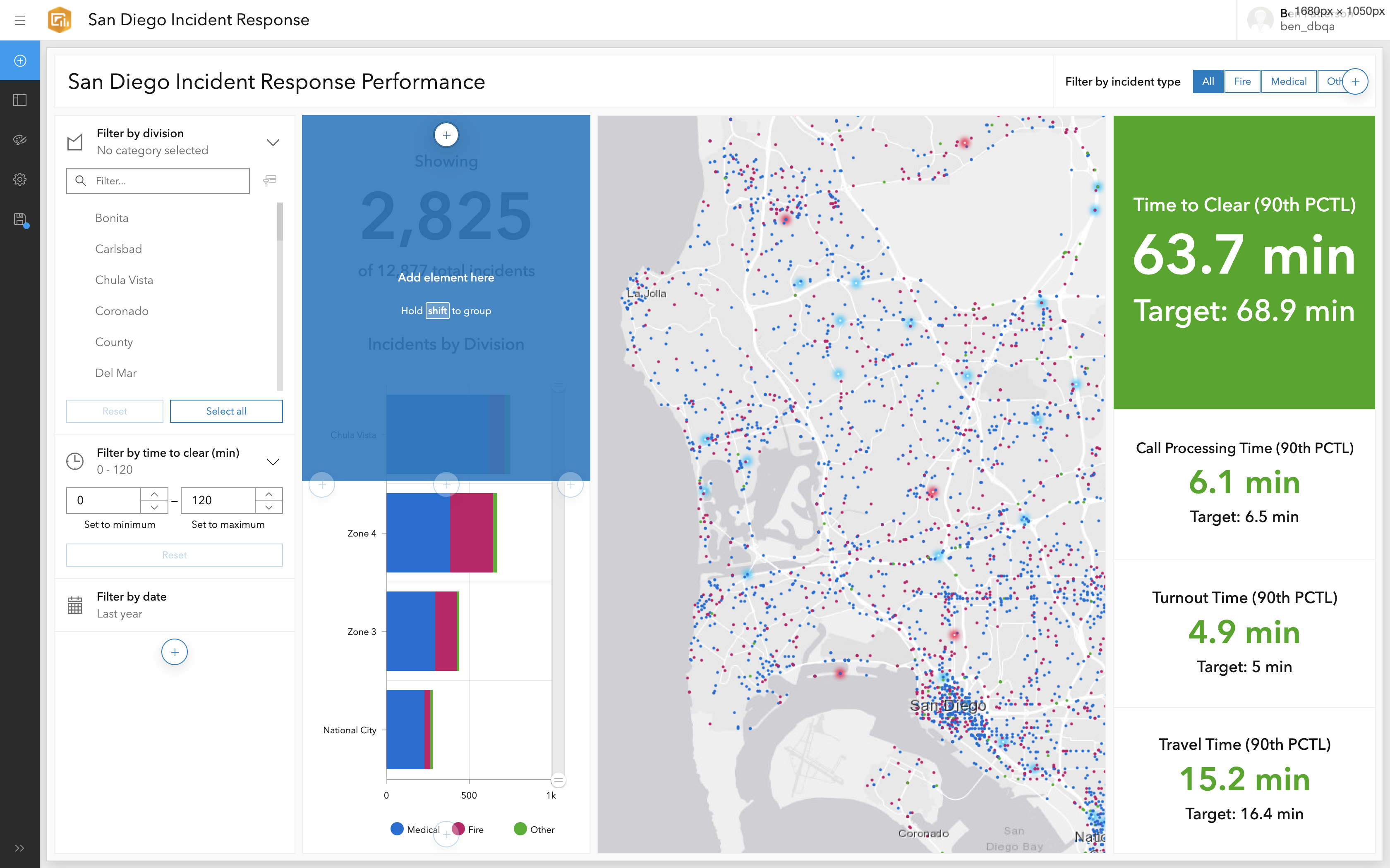
The first phase introduced a new top level navigation, improved onboarding, and a new way for users to edit their dashboards called the layout panel. We left all of the configuration menus untouched.
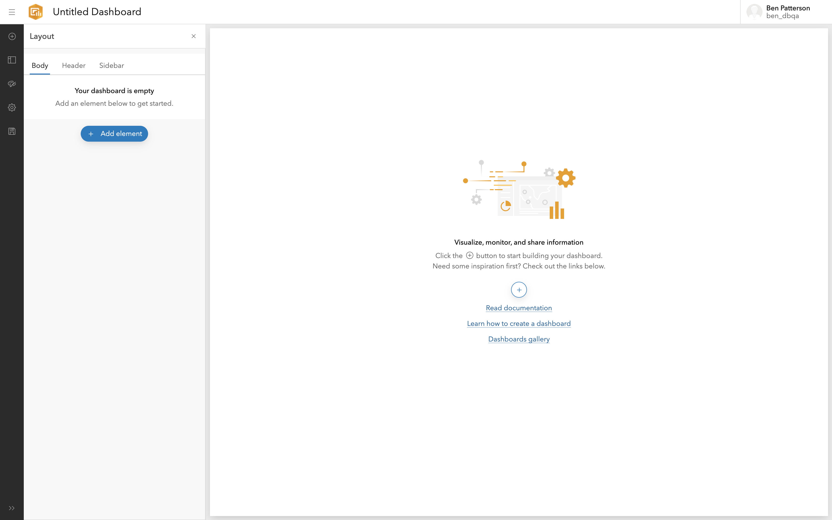
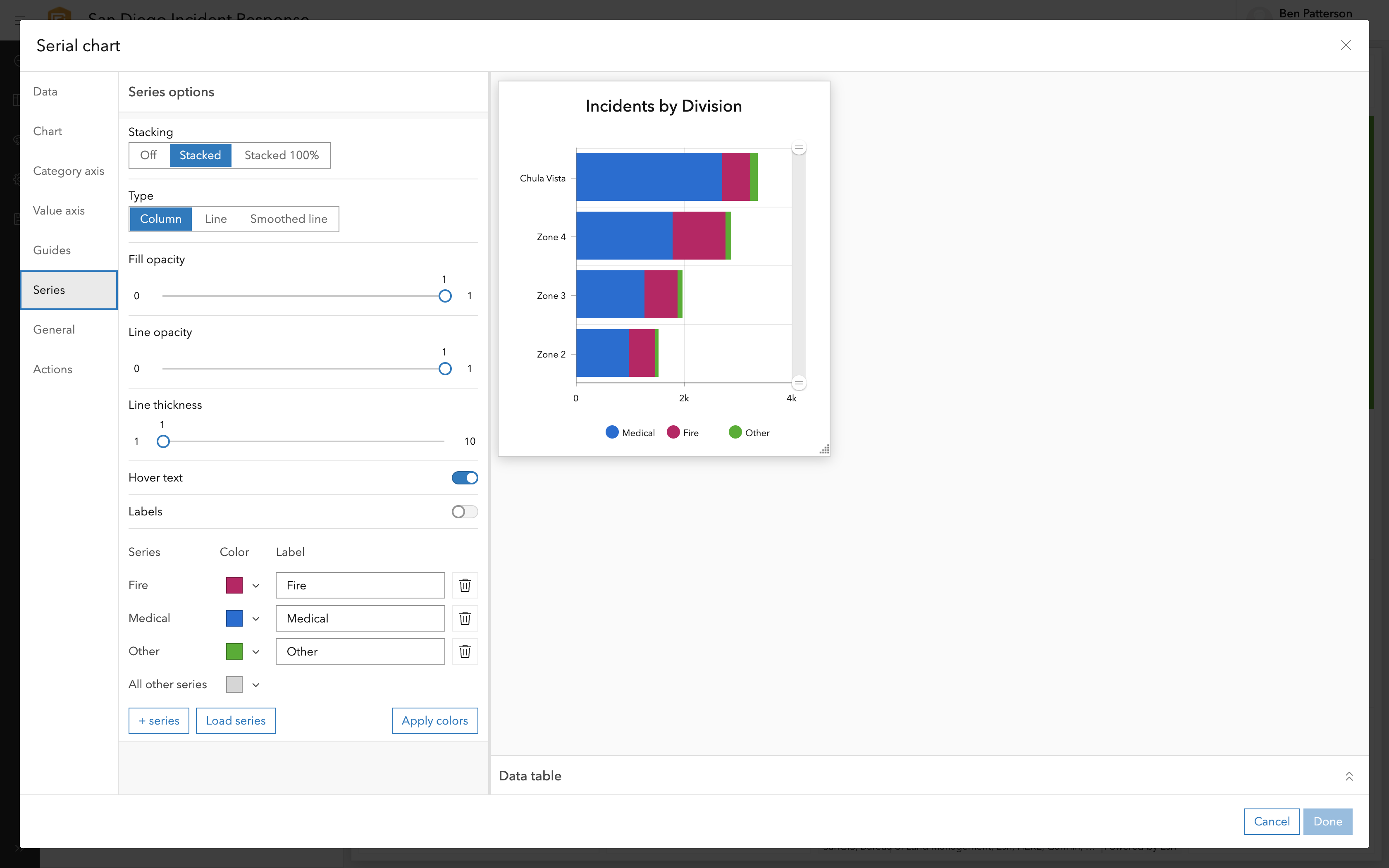
Phase One was positively recieved during our usability testing session. However, we found that some users wanted to close the Layout Panel as they edited their dashboard, but this removed the very important "Add Element" button from the UI.
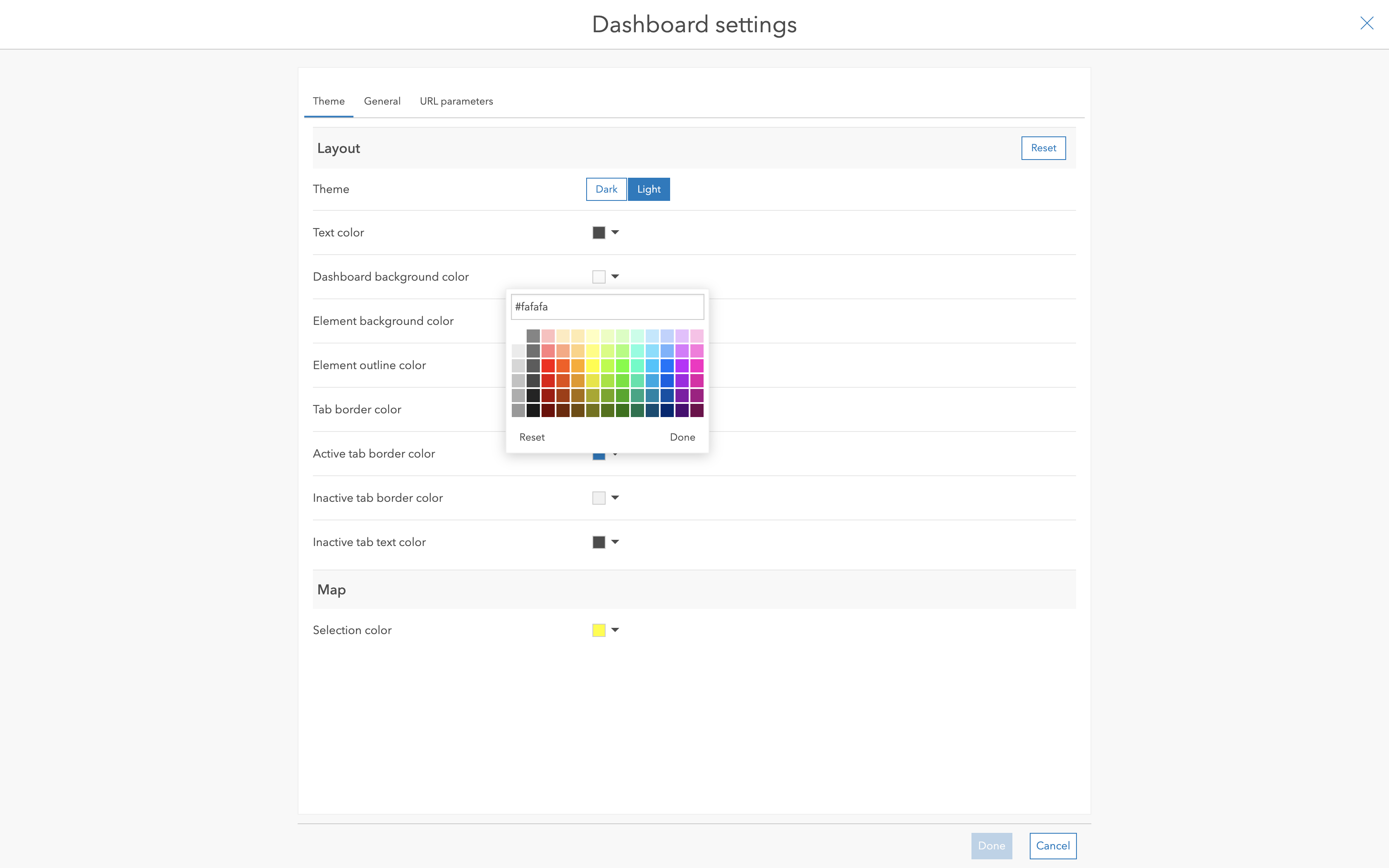
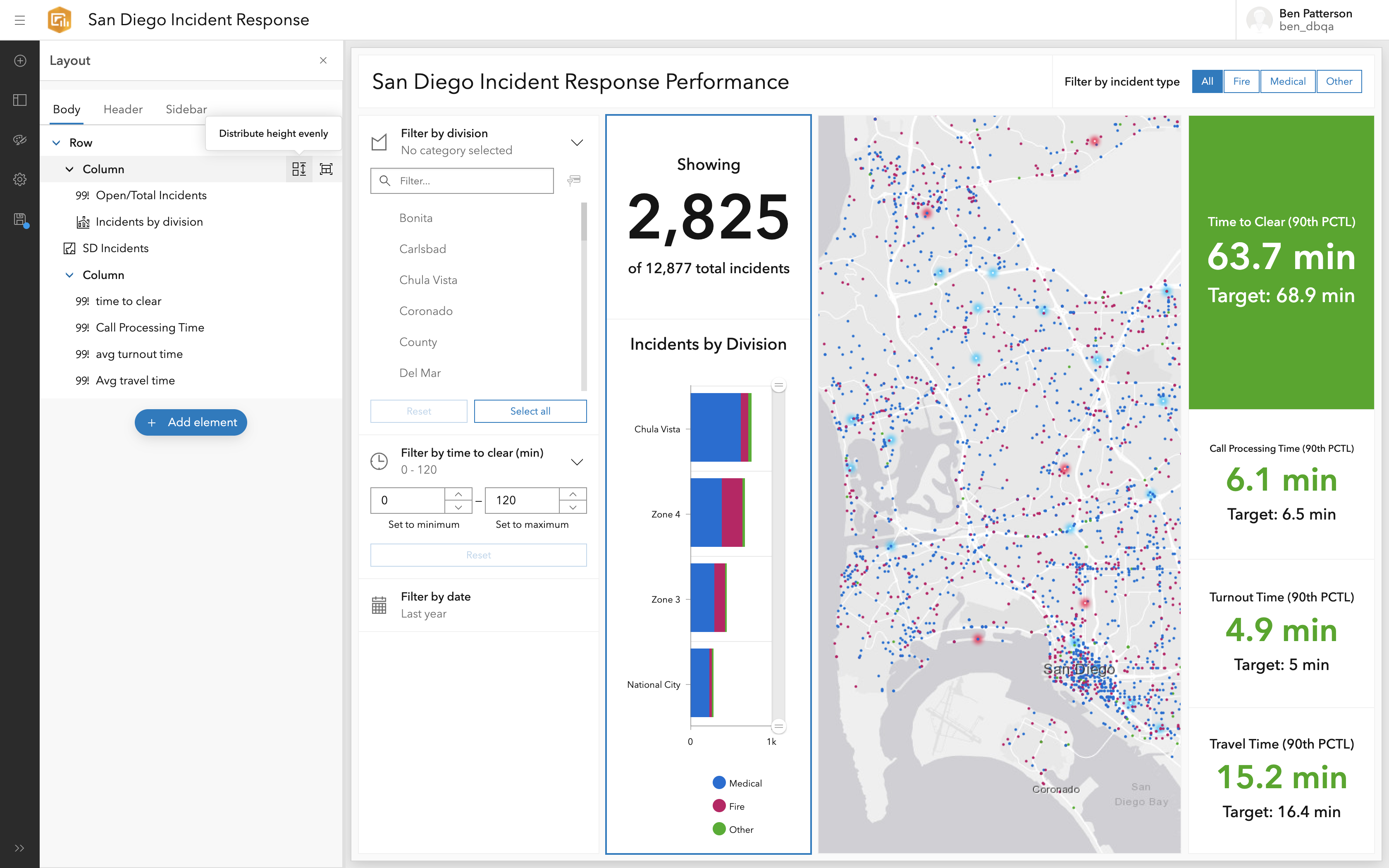
Phase two brought Calcite to all the configuration menus. Most of them stayed about the same, but we were able to make improvements in select places. We were also able to address concerns about the Layout Panel and "Add Element" button brought up during our phase one usability testing.
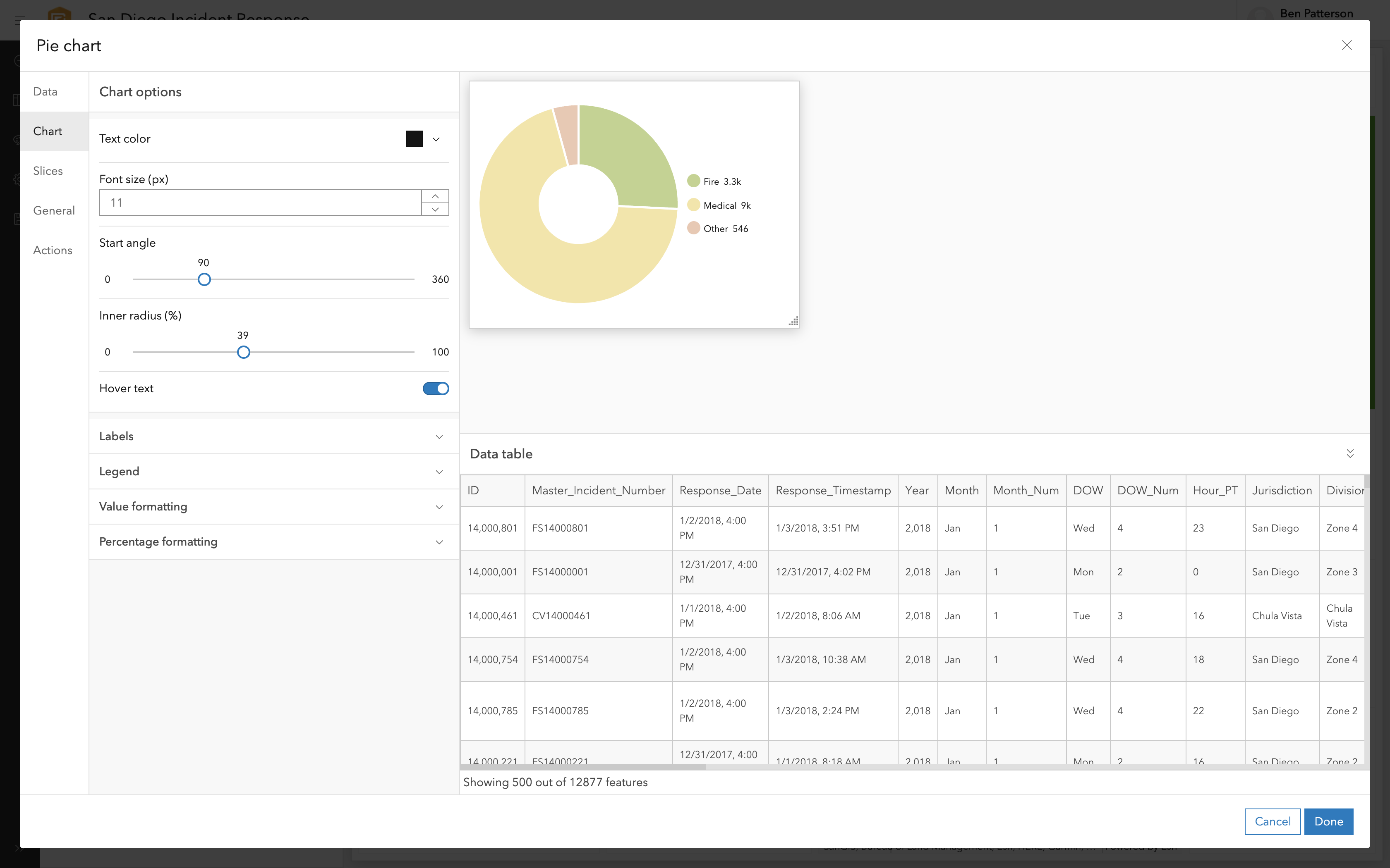
Our usability testing for Phase Two revealed a few minor nits that we were able to resolve before release. We also found that the add-in-place feature resolved complaints about the "Add Element" button.
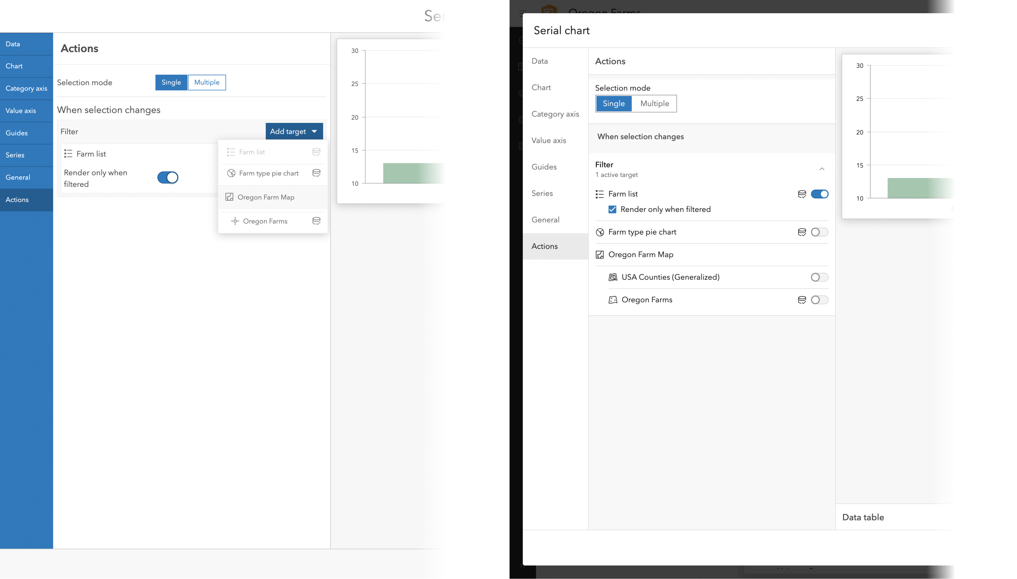
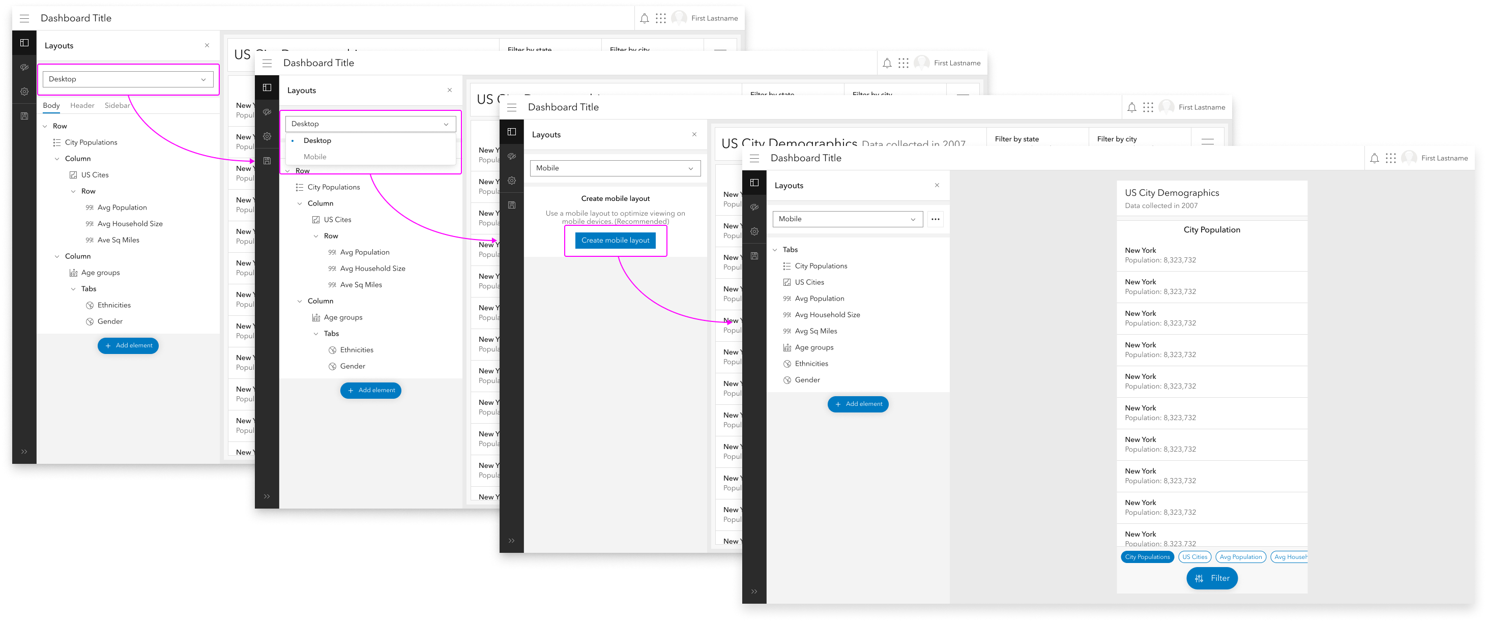
A key part of the project was to set the stage for future roadmap items, the largest of which is cross-device dashboards. As part of the design process for this project, I mapped out rough workflows for supporting this feature.
Transitioning to Calcite has been a win for the ArcGIS Dashboards team. The Calcite team provides regular updates and enhancements, freeing up the Dashboards team to focus on Dashboards-specific problems.
Folding in significant user experience enhancements and setting ourselves up for future roadmap items makes this a win for our users as well.