Research and discovery for a significant new feature in ArcGIS Dashboards
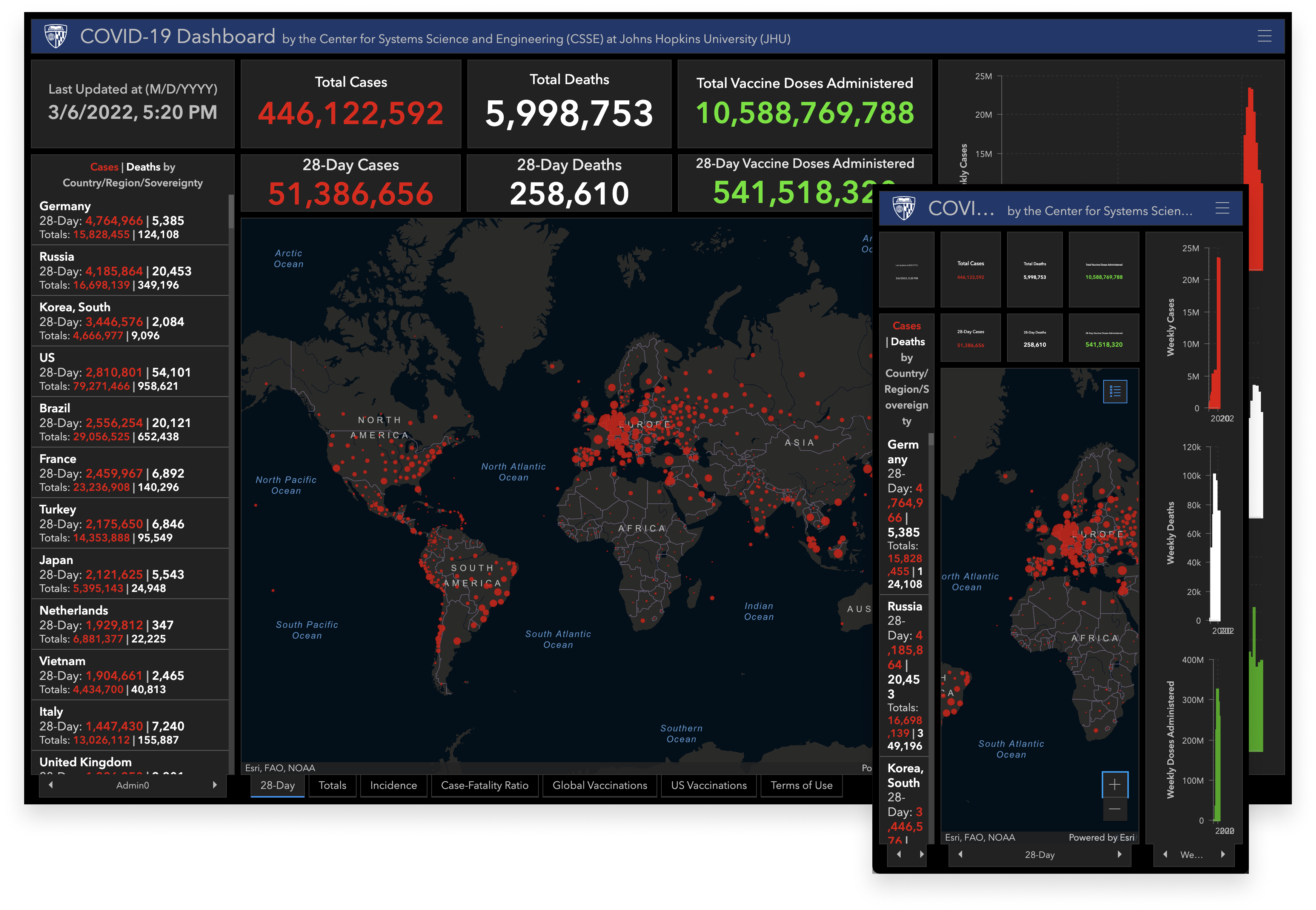
ArcGIS Dashboards has no built in support for cross-device dashboards. A dashboard that looks great on a laptop probably isn't going to look great on a mobile phone. Unfortunately, a growing segment of users were looking at dashboards in both desktop and mobile settings. Since this was a growing problem, the Dashboards team decided to conduct some research and come up with a plan to address the situation.
I started by taking a look at how other products, like Tableau and Power BI, supported cross-device dashboards.
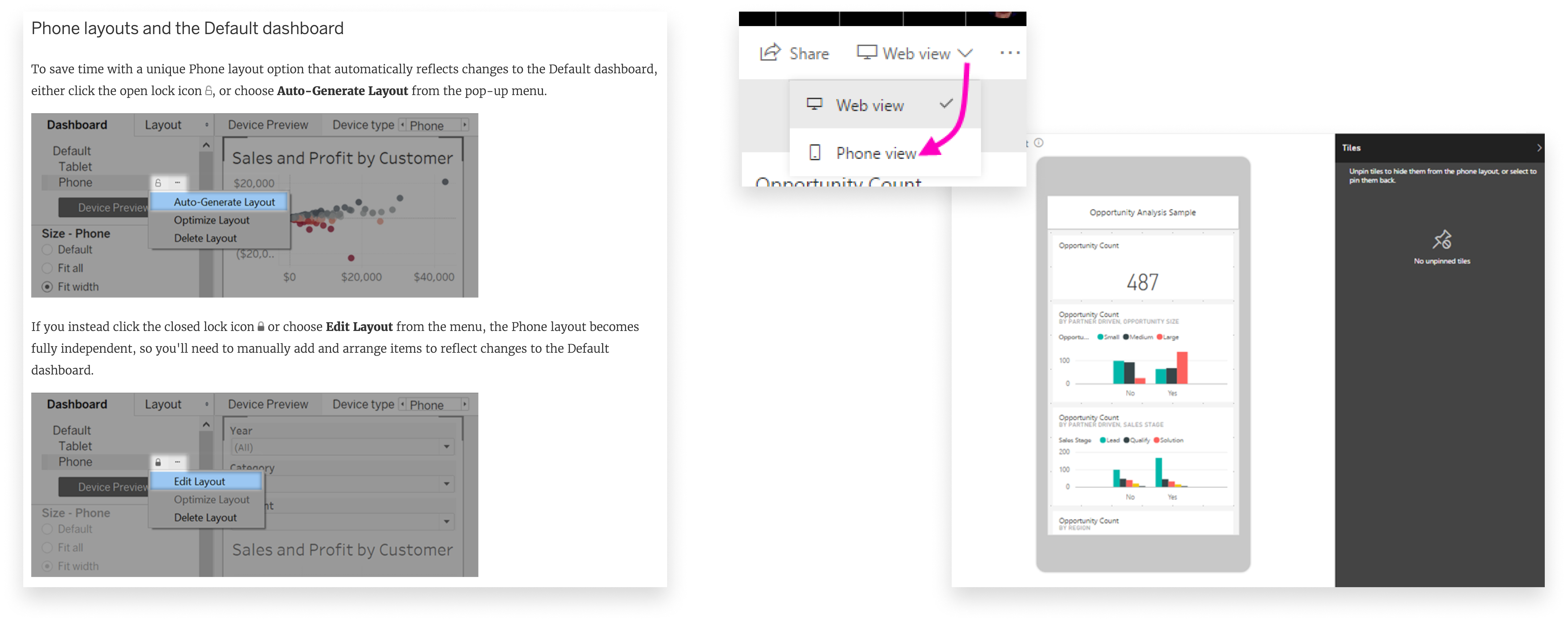
A common thread was the concept of distinct layouts, allowing the author to change how their dashboard was arranged between different devices.
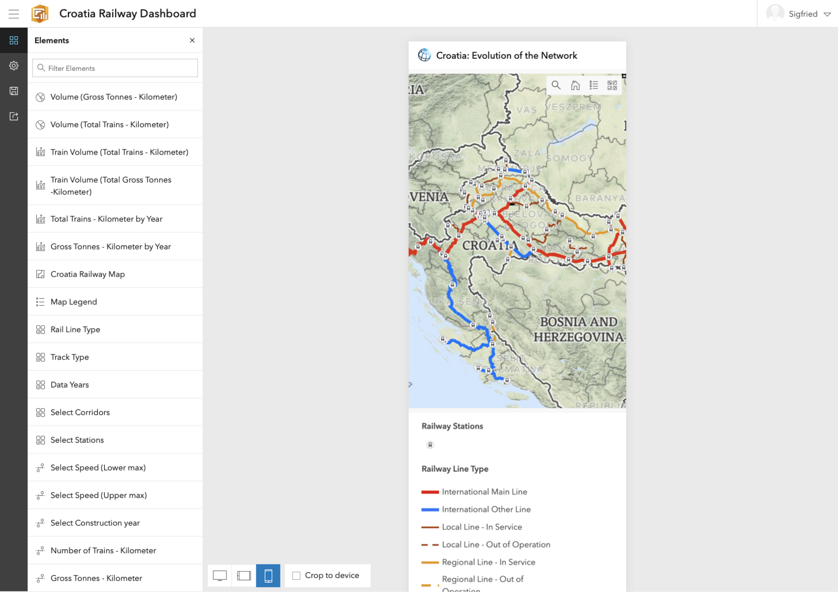
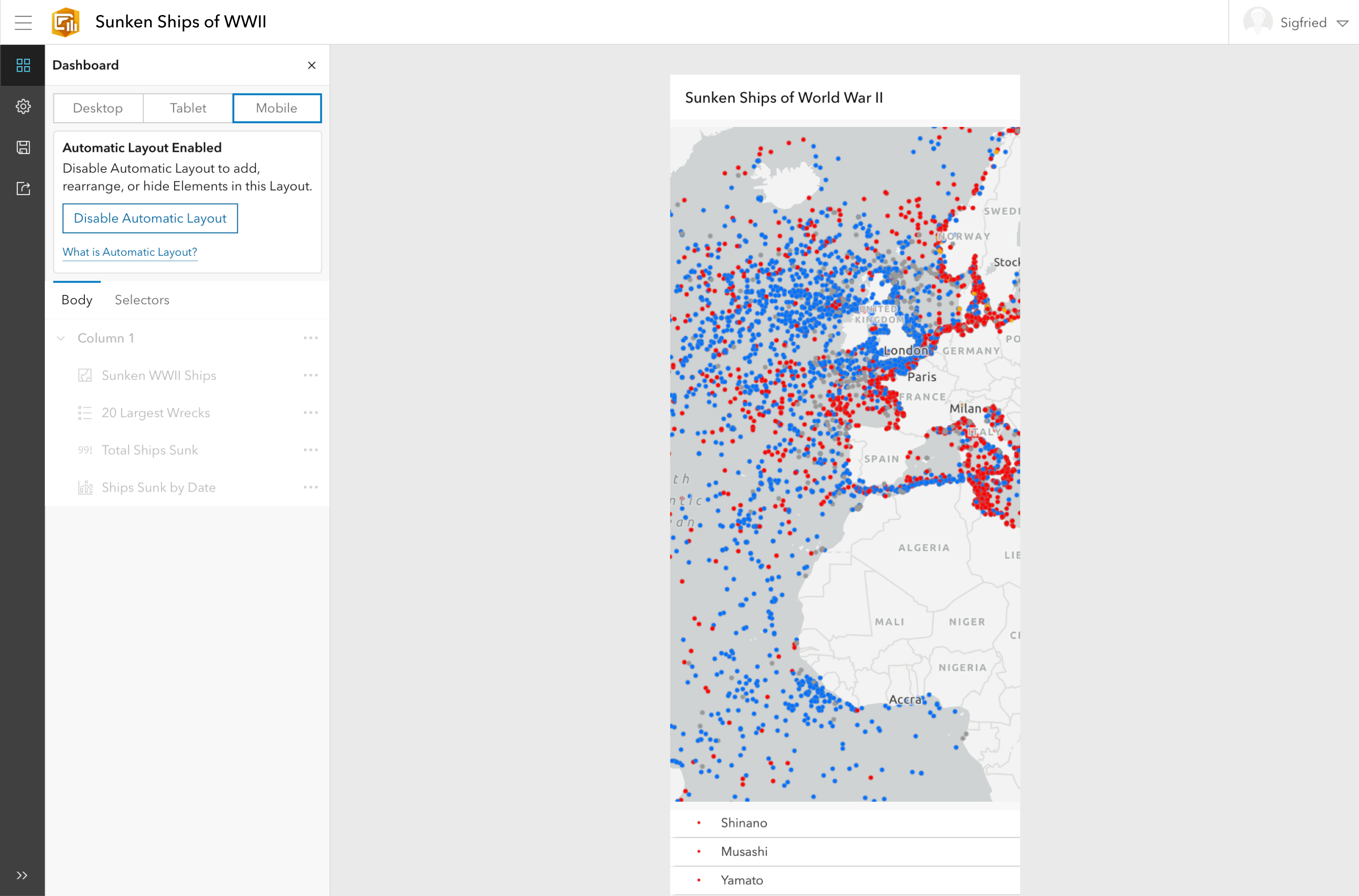
Next, I looked at how our users were going about solving this problem on their own. It turns out they would create different versions of a dashboard, each optimized for a different devices. From there, they would use another Esri product to bring the two dashboards together under a single URL and serve the correct one based on the users viewport size.
At this point I had enough information to begin to think about what the UI might look like. My goal wasn't to come up with a perfect solution, but to come up with something that could be used as an artifact to continue learning about the problem.
An early iteration attempted to make the process really simple. Just choose a device and design your dashboard in that context. But it proved to be difficult to manage how each layout related to one another.
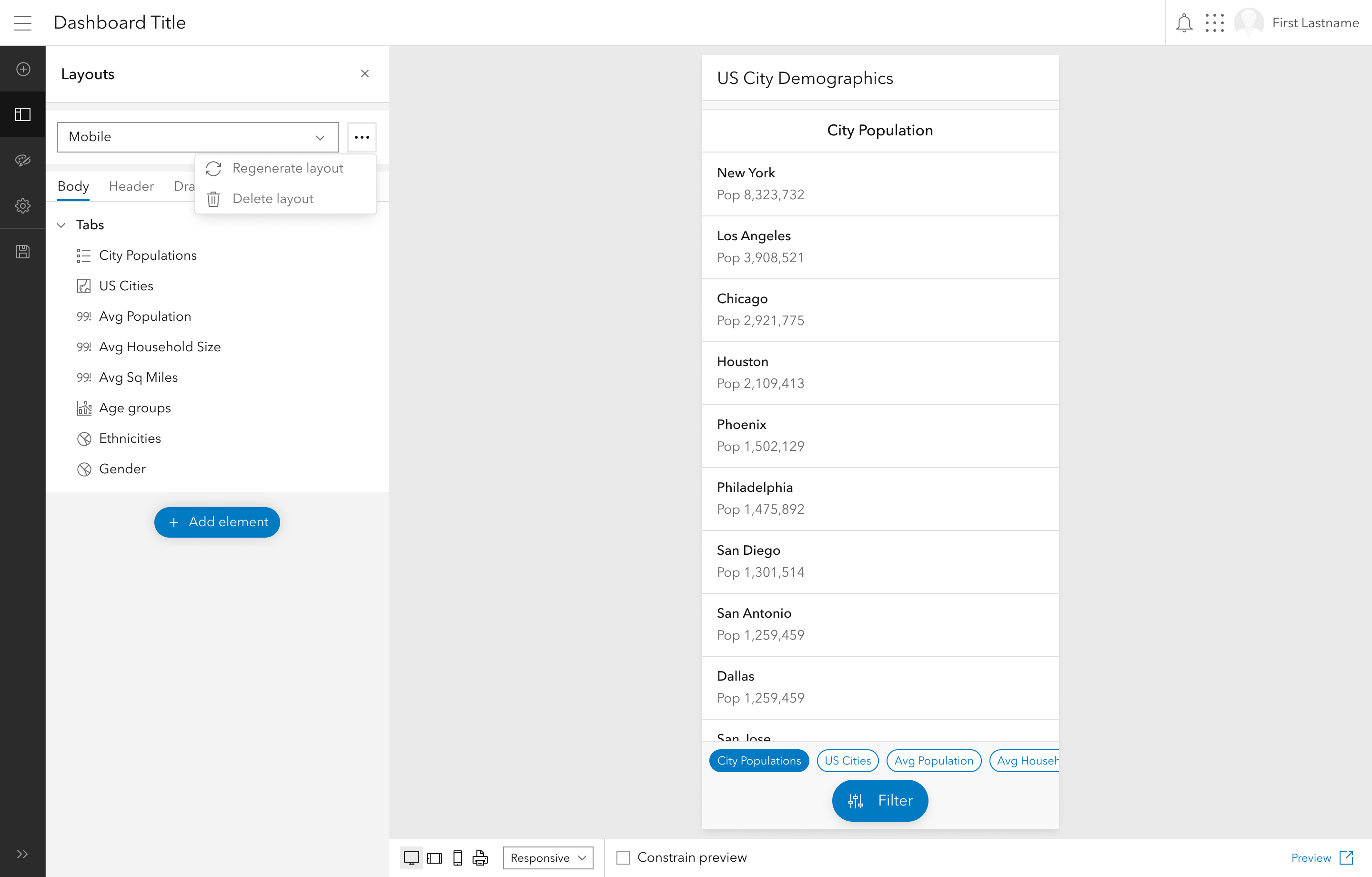
The next iteration created a surface to manage the elements in each layout, but it was just a flat list. The team felt there was an opportunity to encode information about the dashboard layout into the list itself.
The last iteration before testing introduced the layout tree, giving authors a surface to manage their layouts and understand how they relate.
Several key ideas began to emerge from the design iteration process:
Now that I had a set of ideas to test against, I created an interactive prototype, wrote a script, and worked with our user reserach team to recruit participants. I moderated each study while several teammates observed and took notes.
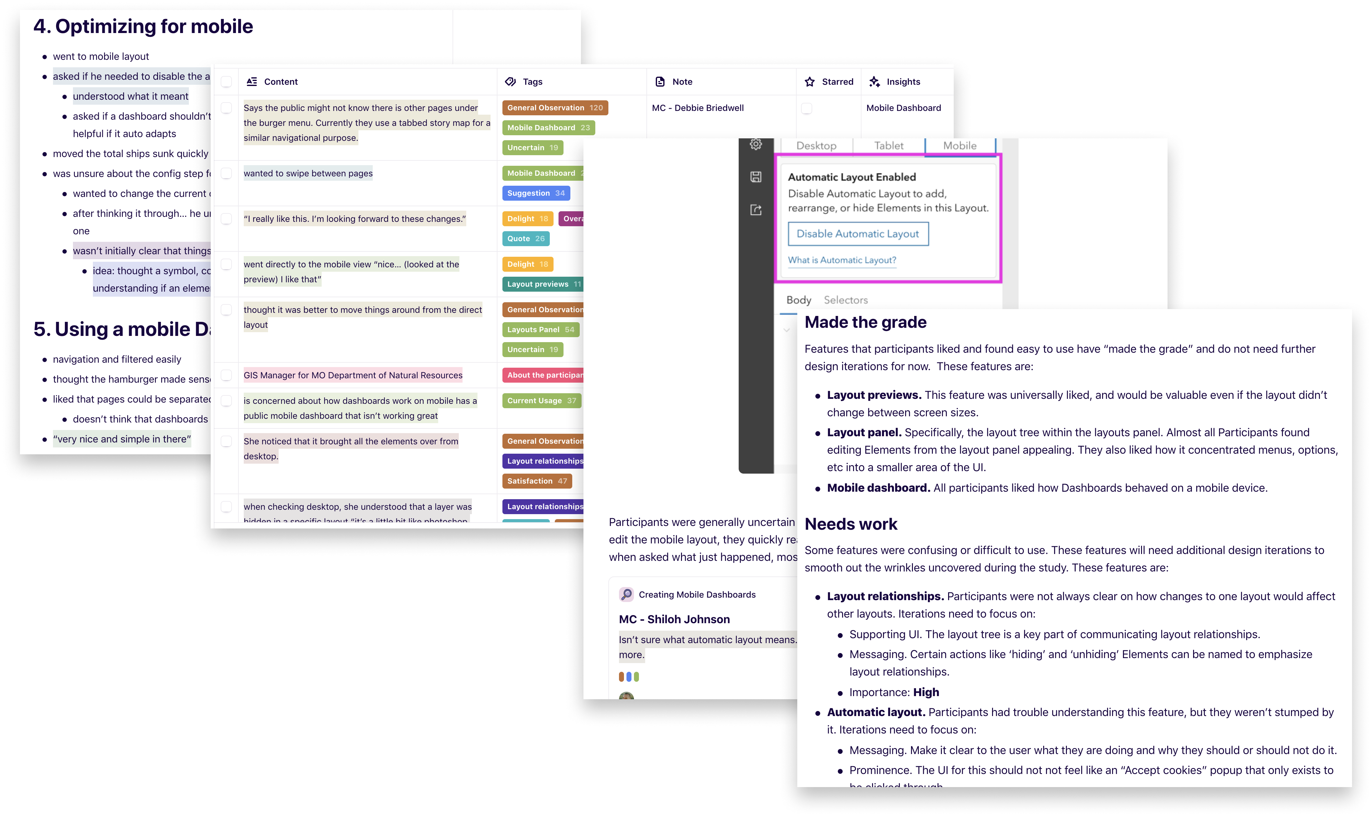
The test revealed that some of these ideas were working well. Participants generally liked being able to view their dashboard at different resolutions, they liked the layout panel, and they liked the overall experience of using a dashboard on a mobile device. They found the other ideas — layout relationships and automatic layout — less intuitive.
Learning how users responded to the ideas allowed myself and the ArcGIS Dashboards team to prioritize work and move forward. With a large project like this, that can be difficult to do. Since this study has taken place, the Layout Panel has been implemented and Layout Previews are on deck to be implemented next, although the latter has undergone significant iteration since this study was conducted.
This project is tightly coupled to the ArcGIS Dashboards Redesign, and as that has developed these features have developed along with it, but the information we learned from this study continues to be the bedrock for our decision making around cross-device dashboards.