Improving the Lytics data management user journey.
While sitting in on a customer call, I learned that managing data inside Lytics could be difficult, especially when trying to determine the overall health of their imports and exports.
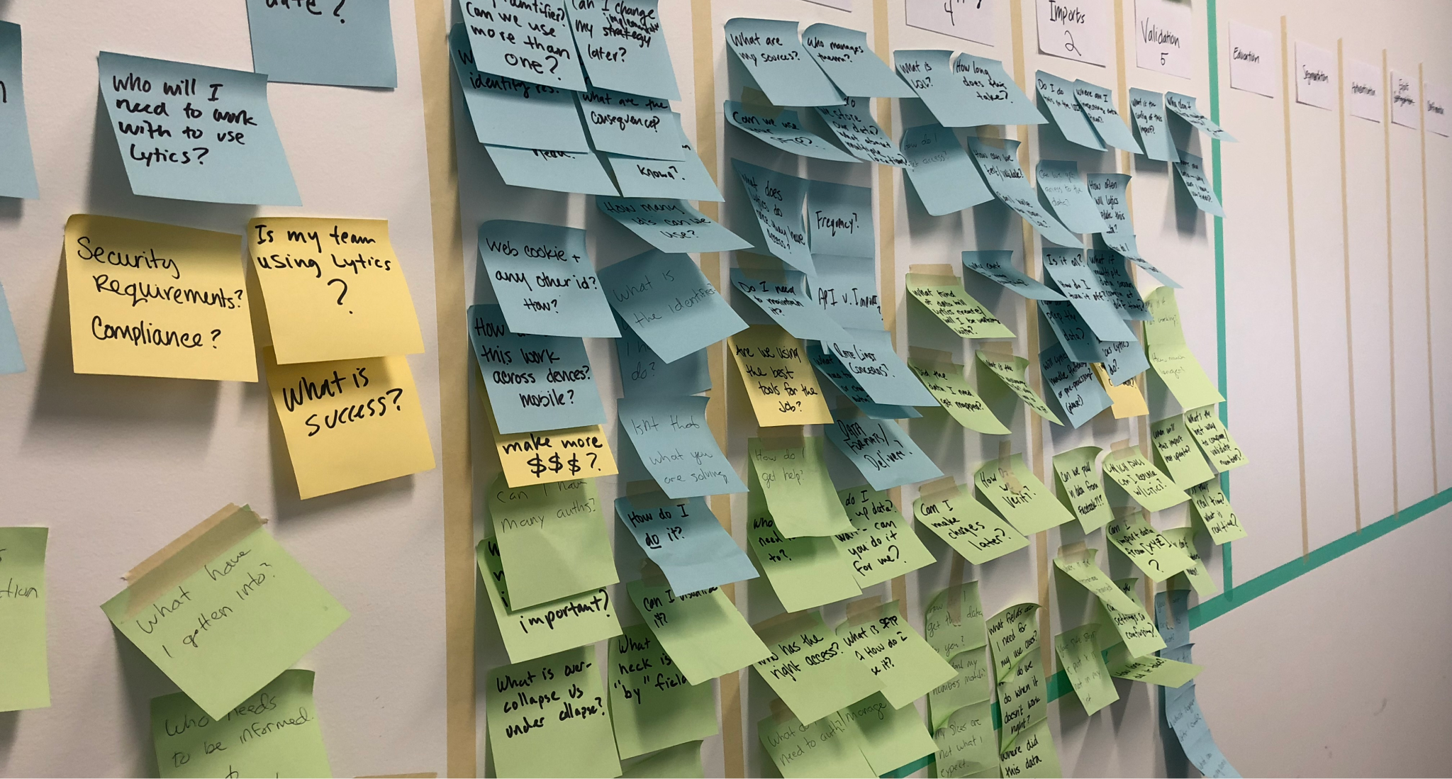
I organized a workshop of internal users to map out a user journey and figure out how to make targeted improvements.
The results of the workshop were distilled down to an easy-to-consume diagram we call a User Journey. This artifact is my own spin on the ideas in Indi Young’s book Mental Models. The diagram helps us identify areas of the user journey that are ripe for improvement.
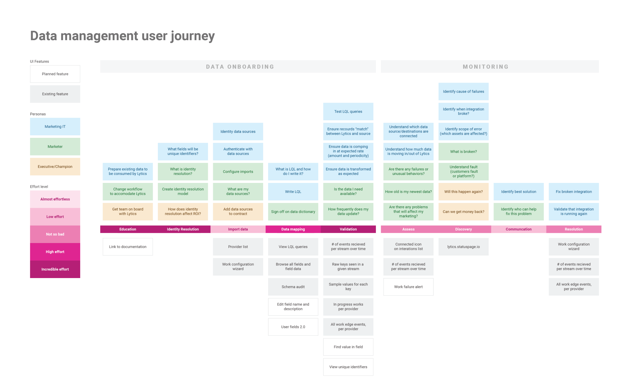
The first step toward taking action on our findings was outlining an ambitous redesign for most of the data management user journey. Of course, you can’t implement all that at once, but it acts as a helpful north star during discussions with stakeholders. Based on what we learned from the User Journey, as well as feasibility discussions with engineering, the design was broken down into chunks that could be implemented one at a time. The first iteration included three big changes:
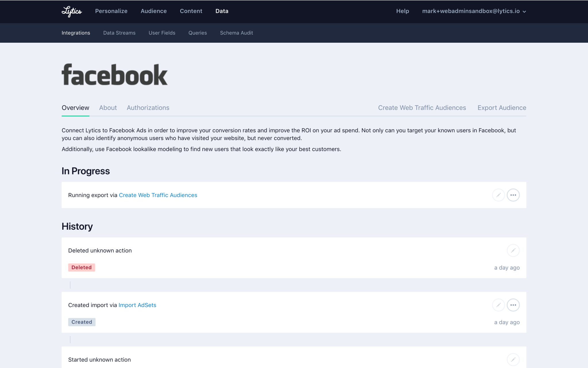
Below is the UI before and changes.
And here is the UI after making each change.
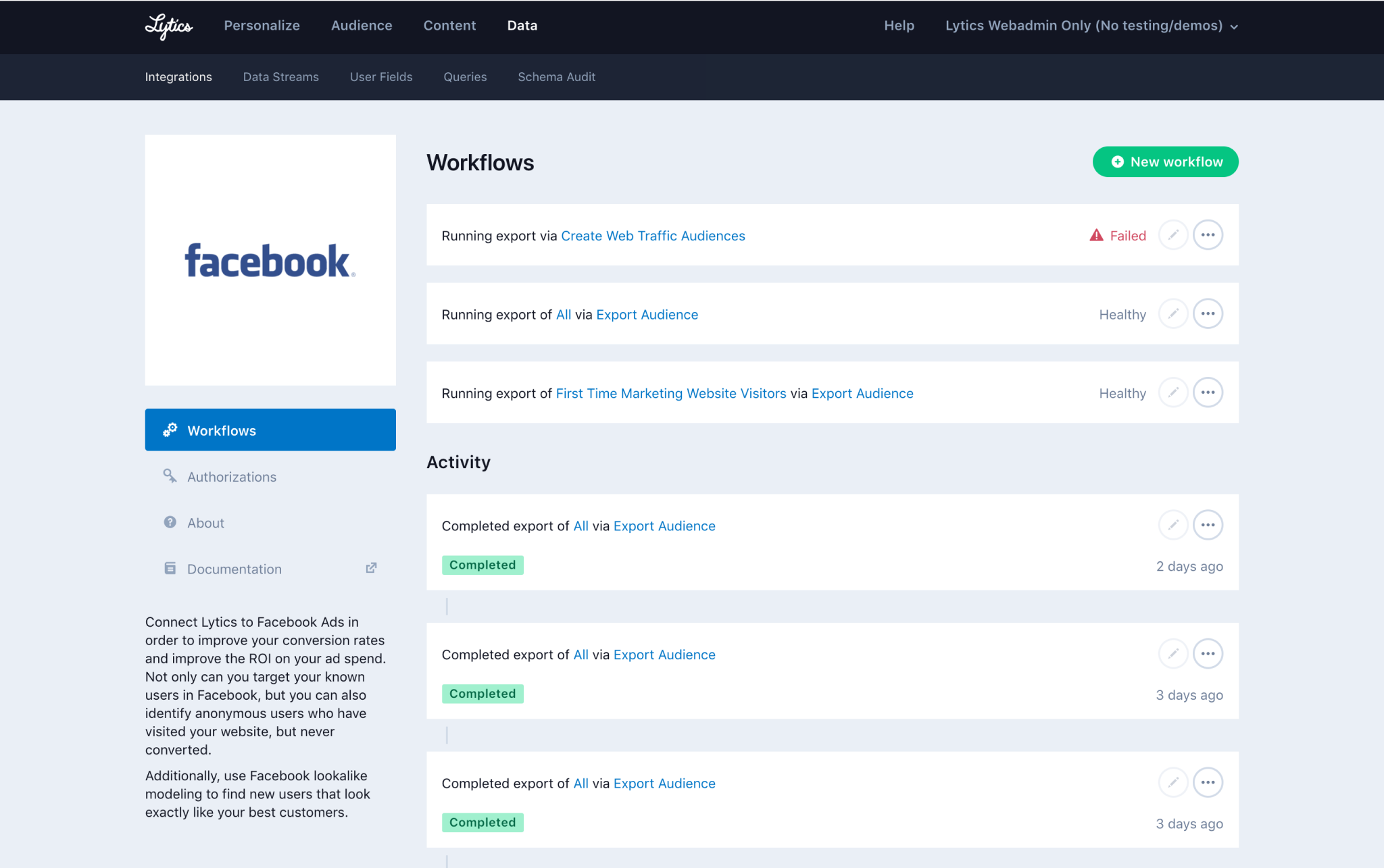
These improvements were a success. Customers were able to quickly find out if an import or export had failed. They could also find relevant documentation a lot faster. We also gained a deeper understanding of where the product was failing (and supporting) our users, enabling us to be smarter about how we prioritized work in the future.